
Data Layers
Better understand the movement of people and vehicles with HERE Probe Data
Mohini Todkari — 24 August 2023
7 min read
13 October 2023

Note: This blog post contains outdated content. If you have questions please use this contact form: http://here.com/contact
In a previous blog posts, we explored HERE Probe data analysis and visualization. In this post, we will continue our exploration by using three open-source software tools that work seamlessly together: QGIS, PostgreSQL/PostGIS, and GIMP. These tools can be used to achieve similar results as demonstrated in the previous blog post using ArcGIS Pro.
QGIS is a free and open-source desktop GIS application that can be used to view and edit vector data and raster data. PostgreSQL and PostGIS are spatial extensions of PostgreSQL that can be used to store and manage spatial data. GIMP is a free and open-source image editing software that can be used to enhance and edit images. By leveraging these tools, we can create powerful and insightful visualizations of spatial data.
For the purpose of the present step-by-step article, we use QGIS Version 3.28.11 LTR, PostgreSQL version 15, and GIMP version 2.10.34 on the Windows ecosystem.
In a previous blog post, we showed how to download and convert probe data protobuf into CSV files. We will be using the same data that consists of:
2 days of Paris probe data with the following attributes: latitude, longitude, speed, heading, timestamp, and traceID.
The Area of Interest defined by the Administrative Level 3 of Paris, and
The 10 most visited places in Paris are identified as Paris POIs.
For this step, let’s create a database in PostgreSQL because it’s easy to organize and maintain. With PostgreSQL, CSV files can be imported flat and transformed into tables with dimensions, while the PostGIS spatial extension allows us to create spatial analysis and spatial indexing. PostgreSQL also integrates seamlessly with QGIS. One of the advantages of importing CSV files directly to PostgreSQL/PostGIS is the conversion of data in one step. You can achieve this with the steps below:
Speed and Heading to INTEGER Data type
Latitude and Longitude to Point GEOMETRY Data type
Timestamp to DATE Data Type
In this tutorial we’re not going to detail how to load data into a PostgreSQL database and perform typecasting. There are many great tutorials online that will help you achieve this, for example this tutorial.
Let’s finally open QGIS and connect with the PostgreSQL database created. Go to the browser, search for PostgreSQL, right click > New Connection

Dialog to open the connection with a PostgreSQL database in QGIS
After the connection is established, QGIS can be used to visualize our map, query spatial data, and perform spatial operations in the interface. Let’s reduce the data to one day and clip to Paris' Administrative Boundary level 3. In the menu toolbar click on Database > DB manager

With the DB Manager window open in the “probe_analysis” database with the schema “an01” we can see the tables from the project. Let’s create a new layer based on one day and inside of the AOI executing the following SQL instructions in the SQL Window.

We just created a new dataset of probe data in the AOI with more than 5 million points!

Layer obtained from the query. Probe data inside of Area of Interest (AOI)
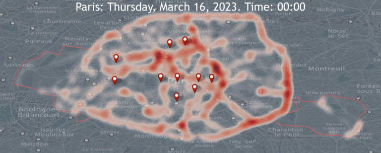
With the new layer we will select symbology and in the renderer selection drop-down, select Heatmap renderer. Next, select the Reds color ramp from the Color ramp selector. Adjust the Radius value to 5.0. At the bottom, expand the Layer Rendering section and adjust the opacity to 70.0%. This gives us a nice visual effect with a dark background.

After the changes have been applied in the Layer Styling, we will have a map similar to the image below.

Heat Map of 24 hours of probe data
Now it’s time for the temporal controller. Go to layer probe_20231603_AOI, right-click > properties > Temporal. In the Temporal tab enable it by clicking the checkbox, select Single Field with Data/Time in the Configuration drop-down menu, sampledate as Field. Click OK.

We will see the clock symbol next to the layer, this allows us to use the Temporal Control Panel in the Map Navigation Toolbar.
It might be helpful to have a label with information about the time of the frame being displayed. Let’s go to View > Decorators > Title Label Decorators. With the Title Label Decoration open, let’s click the Enable Title Label check box.

Enter the text, Insert or Edit an Expression to display the time step, and modify the text's font, color, and position. Click OK.

Press the play button and you can see the animation with the text changing at every time step.

To create the animated gif, we need to export the frames every 15 min. Click the disk icon to export animation. You will need to provide the output directory and select the extent to Map Canvas Extent. Click Save and wait until all files are exported to the destination folder.

To create the animated gif, we need to export the frames every 15 min. Click the disk icon to export animation. You will need to provide the output directory and select the extent to Map Canvas Extent. Click Save and wait until all files are exported to the destination folder.
Temporal heat map animation
Heading is information provided in the HERE Probe Data. We can know the direction of travel of each probe point in the Probe data. We want to show one way to symbolize this attribute combined with the speed information to create an interesting visualization. Let’s activate the layer and right-click > Symbology. In the Layer Style panel, we will play with the different options. To assign the rotation we click in the Rotation input, and it will be added an expression to take the field heading as the value.


As the final result, we can get a map with the information of the direction and speed limit that can provide us an easy way to locate roads with the highest speed.
Using some of the concepts explained in this tutorial, I have created the animation below showing the speed and direction of travel based on the information provided in HERE Probe Data.
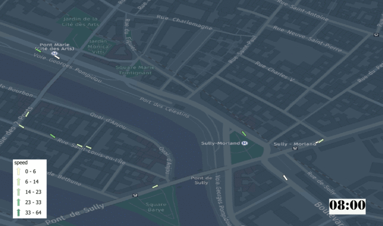
Is it possible to identify the road(s) with the highest speed?
There are endless variations possible with data and we’d love to see what you come up with! Care to share your animation with QGIS?
HERE Probe Data Developer Guide
Introduction to Probe data blog post
Probe data access and download blog post

Walter Molina
Spatial Data Engineer
Share article
Walter Molina
Spatial Data Engineer
Mohini Todkari — 24 August 2023
Mohini Todkari — 05 September 2023
Mohini Todkari — 11 September 2023
Why sign up:
Latest offers and discounts
Tailored content delivered weekly
Exclusive events
One click to unsubscribe

